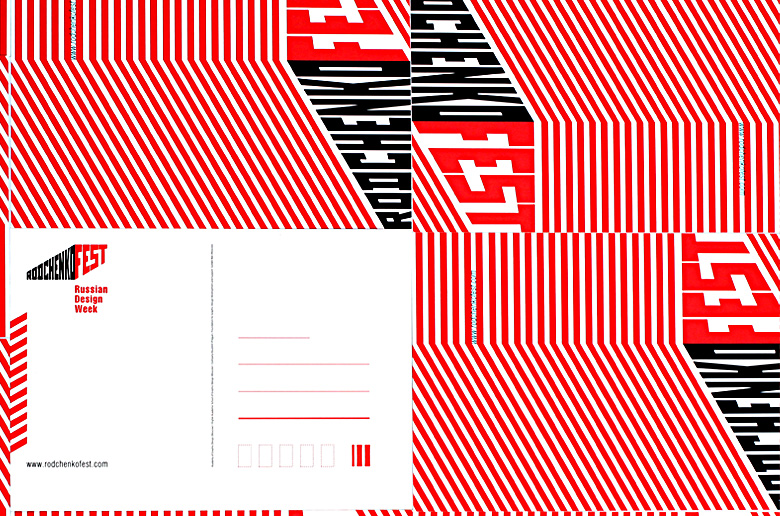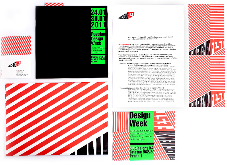
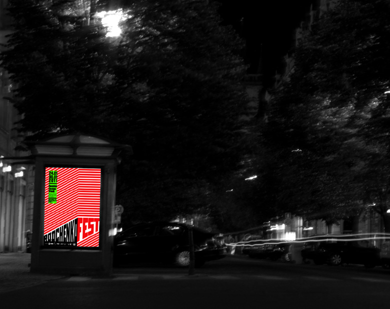
As Rodchenko Fest and Russian Design Week were held simultaneously in January 2011, our target was to unify the two brands at the same ground. The bright, trend stylistics of Russian Design Week has been perfectly implemented into the entire print conception highlighting the idea of succession and modern importance of Rodchenko's heritage in Russian contemporary design sphere.
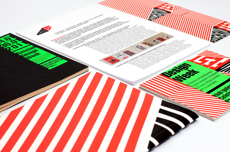
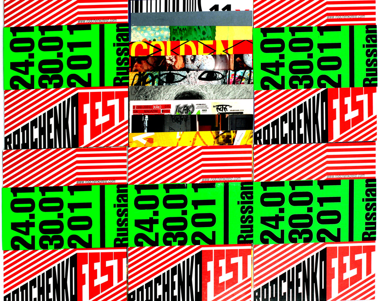
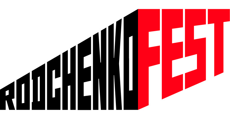
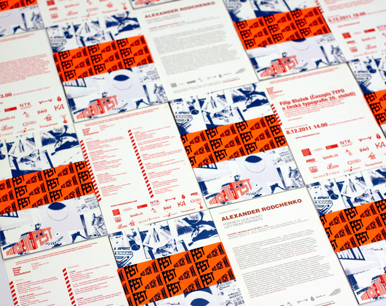
Keeping to Rodchenko's traditional striking shapes in combination with color blocks and sign elements we've created a selection of printed materials for the festival. The heart of this selection has become a set of picture-cards devoted to particular events in terms of the Fest and making up a catalogue when put together.
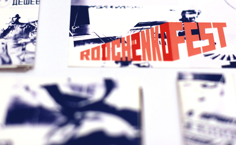
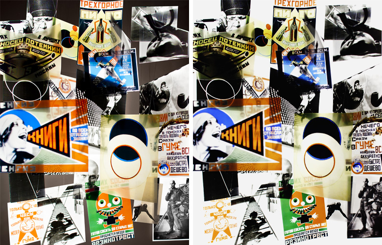
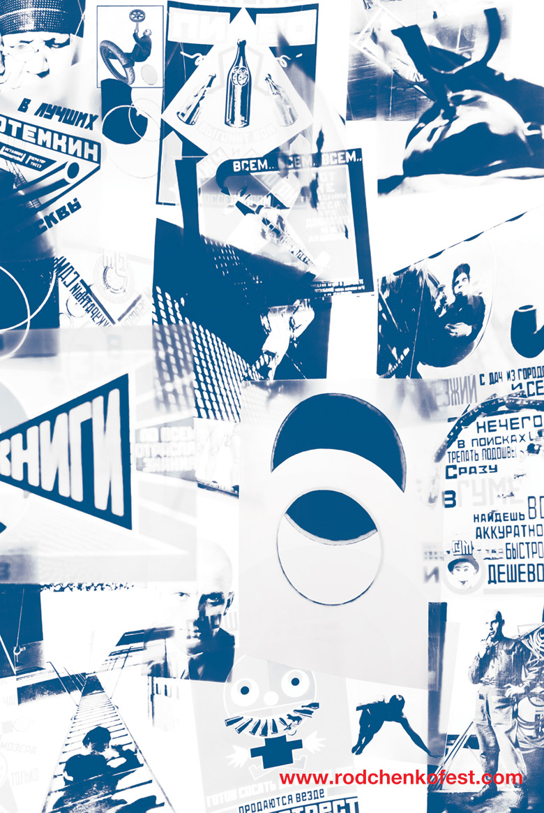
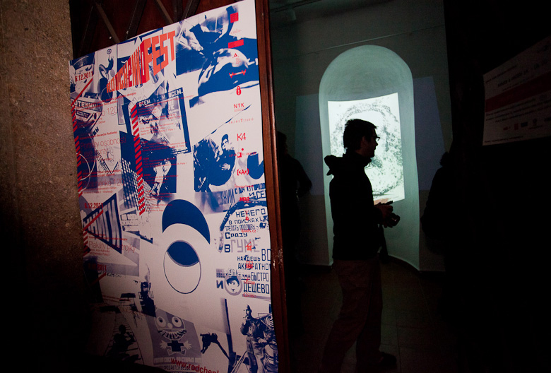
At the end of the year 2011 there was held the second festival devoted to Russian design and the 120th anniversary of Rodchenko's birthday - Rodchenko 120 Fest. The visual stylistics of the second Fest was not derived from the brand's identity like that of the first one, it was created in a special way. We worked up a unique pattern and it was as follows: we took many of Rodchenko's art and photography works, printed them on а transparent layer, hang them together, illuminated from beneath and took a photograph of this composition. As a result we got a monochrome pattern which became the basis of the overall visual conception of Rodchenko 120 Fest. Moreover we considered this pattern not only a simple visual element. In our vision it had an important function which was to reflect Rodchenko's rich, many-sided and versatile heritage in the light of the new modern design approach.
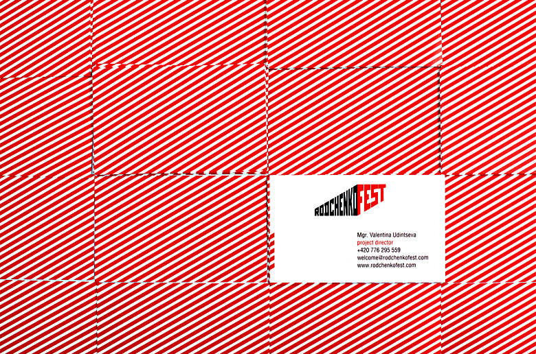
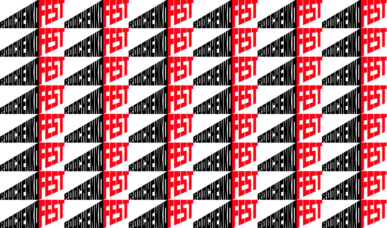
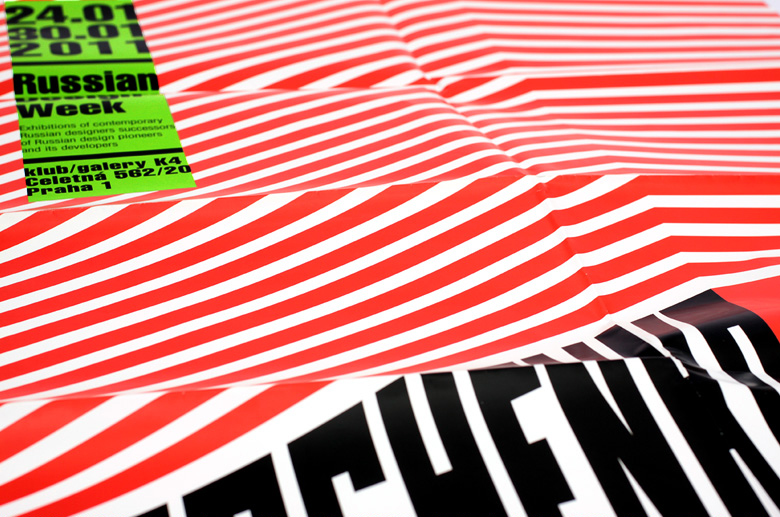
If one takes a look over Rodchenko's photography works there is one beloved theme easy to define - an unusual perspective of a stairs, the view over it from above. At the heart of this theme we can see traditional for vanguard art aspiration for line-based constructions forming the overall composition. This particular theme and line-based structure we decided to use while creating the visual identity for Rodchenko Fest. Easy and garish color solution formed by red and white slanting stripes is building up a complete laconic image easy to settle in minds.