Print / Identity / Logo Development
Project: Go To
Map for Go to travel agency
In terms of GO TO Altay project the issues we've created are the following:
- logo and brand style elements;
-2012 and 2013 travel-catalogues designs;
-travel map design with routes and places of interest
map detail
map

The brand visual conception and logo style are based on the typing which can be generally seen during travels: in tickets, electronic boards at transport stations and airports, in documents, luggage stickers etc.
Четкий грифон
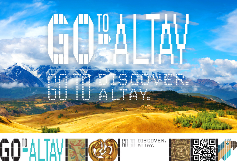
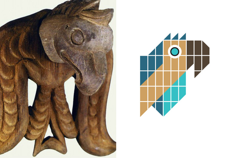
Altay's griffin is a brand associated character we've chosen for GOTO Altay project. It's a mythic animal with eagle's head and lion's body declared the symbol of the region since ancient times. Altay's griffin symbolizes power and mystery and therefore successfully contributes to the company's legend
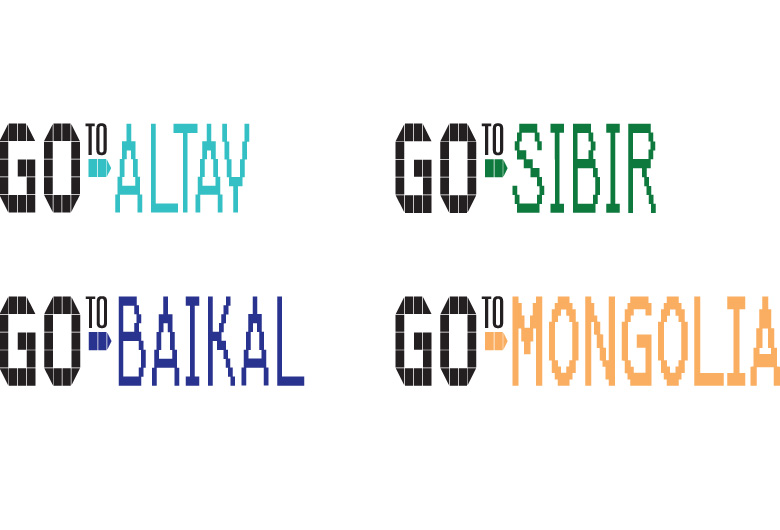
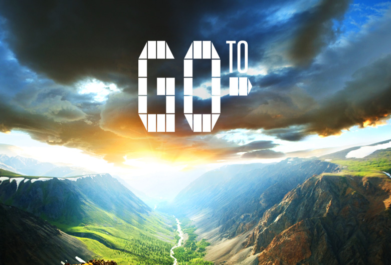
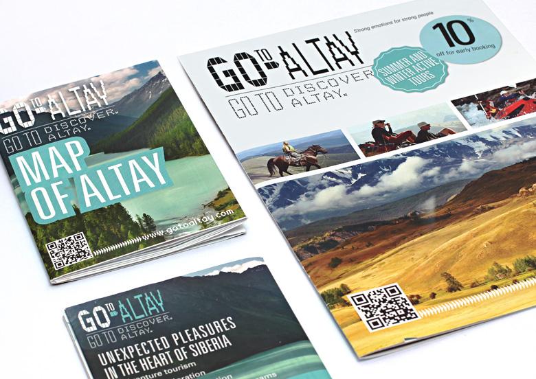
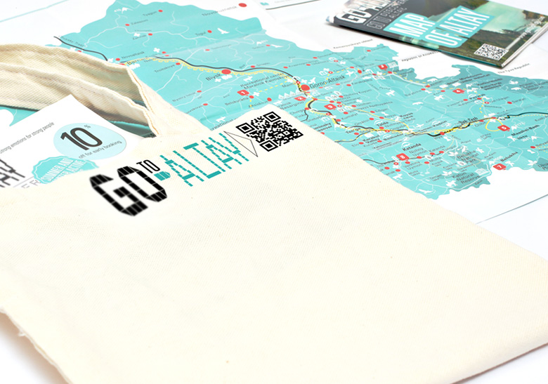
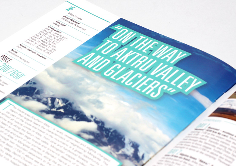
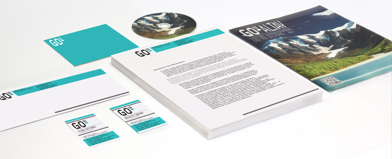
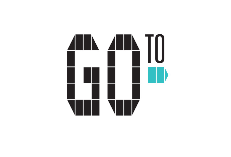
Working on GO TO visuals we started with creating a universal logo which could be easily adopted by the other projects of the company. Taking this logo as a basis we continued working up visual stylistics for 4 travel directions: GO TO Altay, GO TO Baykal, GO TO Sibir and GO TO Mongolia. For each of them we found basic color solutions coming from main visual associations: Altay is blue sky, lakes and glaciers, Baykal is dark blue waters of the deepest and purest lake, Sibir is green expanses of taiga, Mangolia is yellow sands of Gobi desert.
To sharpen the perception of Clear graphic brand elements we put them together with rich wild nature backgrounds. Here the bright picture gives rise to a strong emotion which fixes the graphic image in consumer's mind
GO TO project is aimed at active, modern and mobile customers open to new discoveries and emotions. Working on the company's visual identity we headed for creating a bright, fresh and emotionally imbued image which could easily settle in minds
Get
in touch
Name
Phone
Email
Text
Send