Cool Tour’s identity is mainly built on typography style. Font graphics combines with contrast color blocks gives birth to bright clear solutions which can be perfectly expressed in printing.
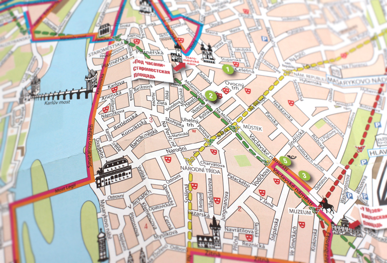
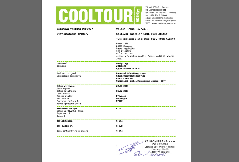
We’ve worked up a wide range of print materials for Cool Tour – from excursion vouchers of various kinds to detailed travel maps with best routs and main sights.
Due to common efforts of the agency itself and our design studio Cool Tour today is fairly the most prominent, bright and stylish excursion agency in Prague.


In addition to the common visual conception of Cool Tour brand we’ve created a set of illustrations which can be used in various examples of printed materials. “Drawn by hand”, a bit childish pictures called up by the friendly Prague spirit with its’ pacific citizens and relaxed beer taverns are perfectly blended with the clear typographic brand style.

Cool Tour is a young modern travel agency in Prague providing excursion programs. We started working with Cool Tour from the stage of the brand’s creation. The aim was to build a stylish, universal image of the company standing out against a background of rather full market. The first thing we did was naming and logotype design regarding Russian speaking customers the main target audience of the project. “Cool Tour” is a pun which came into being from the consonance of the English phrase with its’ Russian comic sounding [kul’tu`:r] hinting at the “cultural” character of the services offered by the company. At the same time the name “cool tour” in its’ direct translation into Russian establishes a modern, nifty and a bit kitsch image of the company.

The name’s idea found its’ further development in the bright, garish logo conception looking completely unlike other market players. The logo’s idea was derived from the coupon form which can be usually seen while visiting places of interest, museums etc. Cool Tour’s logo is dynamic, its’ shape and proportions can be easily transformed depending on the aim of its’ use.