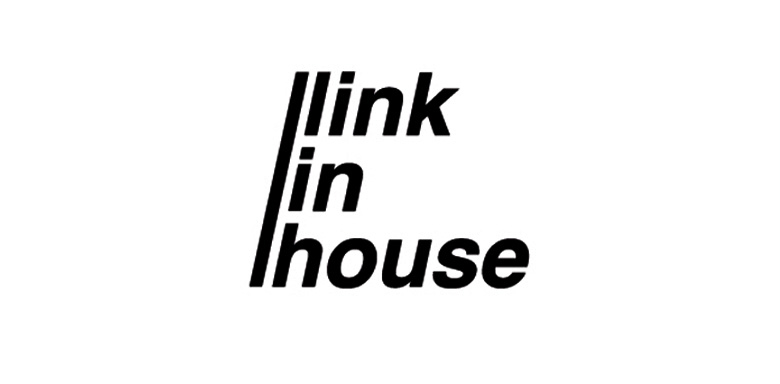
What is the main quality of a good real estate agency? Right, it’s reliability. This particular characteristic we embodied in the straight, crisp, monochrome lines of Link-in-house’s logotype.
The crucial element of the logo’s entire composition is a slanting line looking very similar to the “slash” sign used in the Internet links – a special metaphor telling the company is dynamic in actions, easy to deal with and looking forward to the future.
The crucial element of the logo’s entire composition is a slanting line looking very similar to the “slash” sign used in the Internet links – a special metaphor telling the company is dynamic in actions, easy to deal with and looking forward to the future.

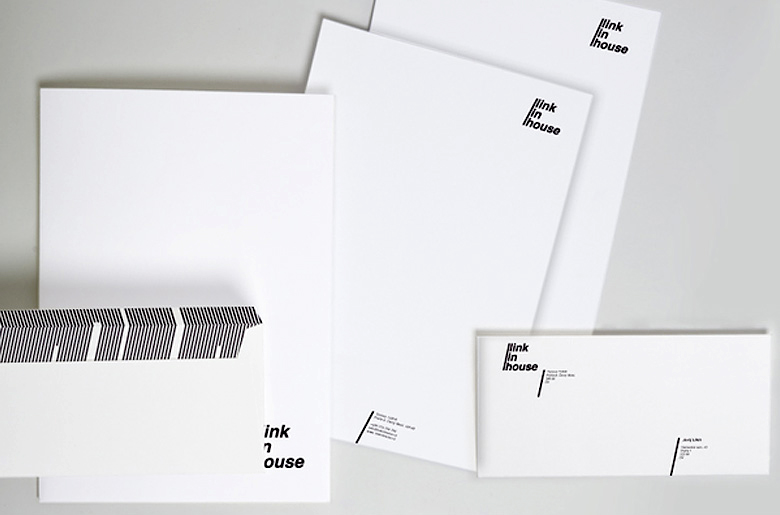
Key ideas used in the logo creation found their course in the entire visual brand concept. Strict black-and-white color spectrum, usage of the core “slash” element in personal cards’ and corporate documentation’s design form a complete image of a modern reliable company providing easy and quick solutions.